Thứ Ba, 29 tháng 10, 2013

“SEO một keyword lên top Google trong 1 tháng”

Khi bắt đầu với bất cứ dự án SEO nào, dù là lớn hay nhỏ thì việc đầu tiên mà chúng ta nên cần làm đó là lên kế hoạch nghiên cứu và chọn từ khóa thích hợp nhất để SEO. Chọn từ khóa ở đây không nhất thiết là bạn phải chọn từ khóa có độ cạnh tranh cao hay được nhiều người tìm kiếm vì các từ khóa bao quát như vậy giờ đã lỗi thời, không phù hợp với kỹ năng tìm kiếm của người dùng hiện tại. Trong phần 1 của serie này, tác giả Sitle sẽ giúp bạn tìm hiểu qua các bước chọn từ khóa khi SEO, mà cụ thể ở đây là sẽ nhắm tới các từ khóa dài, có tiềm năngđộ cạnh tranh thấp nhưng vẫn được nhiều người tìm kiếm.

PHẦN 1 : LỰA CHỌN KEYWORD TỐI ƯU KHI SEO

Đối tượng cần xem bài viết:
  • Dành cho các Newbie mới bắt đầu vào SEO – chưa định hướng rõ ràng về một quy trình SEO tổng thể với một hoặc một bộ từ khóa (liên đới)
Mục tiêu:
  •  SEO một từ khóa chủ đạo  +  kèm theo một bộ từ khóa phụ liên quan lên top 5 Google (Từ khóa longtail >= 4 từ, độ cạnh tranh thấp  , số lượng tìm kiếm hàng tháng ~1000 lượt)
  • Onpage tổng thể website theo chuẩn SEO

Bước 1: Nghiên cứu từ khóa


Bước đầu tiên của quá trình SEO luôn bắt đầu bằng việc chọn từ khóa, việc lựa chọn đúng đắn từ khóa sẽ giúp bạn SEO dễ dàng hơn, nhắm đúng đối tượng khách hàng hơn
Cách SEO 1 bài viết lên top trong 1 tuần

Gợi ý - Sở hữu blog chuyên nghiệp miễn phí

Bạn cần sỡ hữu một blog chuyên nghiệp với các theme trả phí chất lượng cao và hơn 15 plugin trả phí đầy mạnh mẽ trong vòng 4 ngày? Không có gì khó cả, bạn hoàn toàn có thể làm được điều đó với dịch vụ cài blog miễn phí của mình. Bao gồm hướng dẫn sử dụng qua Video và Teamviewer.
Tiêu chí chọn từ khóa khi bắt đầu SEO
  • Luôn bắt đầu với từ khóa longtail – tức từ khóa có độ dài từ 4 ký tự trở lên, kèm theo một bộ từ khóa phụ khoảng 5 từ.
  • Cạnh tranh thấp
  • Lượng tìm kiếm xấp xỉ 1k lượt / tháng
Tại sao tôi chọn vậy, hãy lấy một ví dụ đơn giản:

Công cụ phân tích từ khóa mới

Google đã thay thế công cụ phân tích từ khóa cũ thành Google Keyword Planner, bạn có thể xem hướng dẫn tại đây.

1)Từ khóa ngắn đồng nghĩa với kết quả tìm kiếm sẽ rộng hơn-> Thông tin loãng hơn -> Người dùng không thích như thế

cách lựa chọn keyword khi SEO

Mặc dù từ khóa Iphone tìm kiếm khoảng gần 110.000 lượt / tháng nhưng độ cạnh tranh lại là trung bình, trong khi từ khóa “dien thoai iphone 5”, chỉ với 6000 lượt/tháng lại được giới SEOer quan tâm hơn.
Đơn giản vì từ khóa “dien thoai iphone 5” đánh trúng vào mục tiêu tìm kiếm của khách hàng hơn, điều đó khiến cho độ cạnh tranh của nó tăng vụt lên

2) Từ khóa càng dài thì độ cạnh tranh càng giảm, đồng nghĩa với việc bớt dần đối thủ khi SEO

lua-chon-keyword-khi-seo

3) Lượng tìm kiếm vừa đủ

Tại sao lại chọn lượng truy cập <=1000 lượt truy cập / tháng
Ít quá thì SEO chắc chắn không hiệu quả, nhiều quá thì chắc chắn cạnh tranh cao, khó lên, hãy chọn keyword vừa sức với khả năng của bản thân.
Kết: Hãy chọn keyword khi bắt đầu SEO đáp ứng tối thiểu 2/3 tiêu chí trên, công việc SEO của bạn sẽ nhẹ nhàng hơn nhiều lần.

Bên lề: Chọn bộ keyword phụ hỗ trợ SEO

Nếu bạn đã từng liên hệ với bất kỳ một dịch vụ SEO nào, bạn chắc chắn sẽ được tư vấn một bộ từ khóa phụ khi SEO từ khóa chính, có bạn nào đã từng thử liên hệ với một cty SEO nào chưa? Liên hệ thử để kiểm chứng đi :D
Tiêu chí chọn bộ từ khóa phụ: khoảng 5 từ khóa, các từ khóa phụ liên quan chặt chẽ đến từ khóa chính và chứa từ khóa chính bên trong
VD: Tôi seo từ khóa “Iphone 5”, bộ từ khóa phụ của tôi có thể là
  • Dien thoai Iphone 5
  • Gia ca dien thoai Iphone 5
  • Dien thoai iphone 5 chinh hang
  • Dien thoai iphone 5 xach tay re
  • Cach su dung dien thoai iphone 5

PHẦN 2: TỐI ƯU HÓA CÁC THẺ META TỐI CẦN THIẾT CHO SEO

Tối ưu thẻ Title

Được coi là bộ mặt của website trên kết quả tìm kiếm, Title là điều mà người dùng chắc chắn luôn luôn được quan tâm đầu tiên khi click vào website trên kết quả tìm kiếm.
Một số gợi ý khi viết Title cho trang/bài viết cần SEO
  • Độ dài không quá 69 ký tự ( cái này quá quen thuộc rồi nên mình không đề cập thêm nữa)
  • Bắt buộc chứa từ khóa cần SEO nhưng không nên lặp lại quá 2 lần
TipsĐừng đặt Title kiểu “Phim HD, Phim HD online, HD phim, Phim HD hay nhất” => Càng nhồi nhét càng khiến bạn trở thành spammer trong mắt những con BOT của GG

Gợi ý - Justhost chỉ €2,99/tháng

Hosting quốc tế giá rẻ chất lượng cao hiện nay chỉ còn €2,99/tháng. Đăng ký 12 tháng để nhận được tên miền quốc tế một năm miễn phí.
Thay vì vậy có thể đặt là : “Xem phim HD online – Trang tải phim HD online miễn phí
Một title như trên tôi có thể SEO cả một bộ keyword:
{Phim HD, xem phim HD, xem phim HD online, tải phim HD, tải phim HD online miễn phí…}
Vừa tránh bị BOT đánh giá spam, vừa thân thiện với người dùng :D
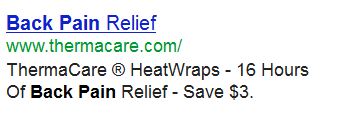
  • Nổi bật Keyword trên kết quả tìm kiếm
Hãy xem một ví dụ
noi-bat-keyword
Sự nổi bật chính là việc keyword xuất hiện ngay đầu của Title, càng ở các vị trí về cuối của kết quả tìm kiếm thì sự nổi bật sẽ giảm dần
TipsQua đây chúng ta có thể xác định được một keyword chúng ta đang chuẩn bị SEO hiện đang có bao nhiêu đối thủ cạnh tranh, sự nổi bật càng nhiều thì chứng tỏ keyword đang được SEO có chủ định thay vì tự nhiên, nếu bạn SEO một từ khóa mà search thử trên Google đến trang 5-6 nó vẫn nằm lù lù ở ngay đầu tiên của Title thì theo mình bạn nên mở bài Khó – Nam Cường nghe thư giãn trước khi bắt đầu SEO nó :D

Tối ưu thẻ Meta Description

Sau Title thì Description mình cho là quan trọng thứ 2 trong các thẻ meta mình đang và sẽ đề cập đến.
Meta Description được dùng để tóm gọn nội dung trang chỉ trong tối đa 160 ký tự, vì thế bạn hãy cân nhắc thật kỹ lưỡng trước khi viết description cho bài viết.
Nó cũng như việc cách bạn chào mời khách hàng như thế nào để khách hàng mới chỉ nghe 1 lần thôi là đã muốn mua hàng của bạn vậy.
TipsMột kinh nghiệm nhỏ của mình khi viết Description là ngoài keyword chính xuất hiện trong description, hãy viết sao để nó có thể bao gọn luôn cả các keyword phụ.
Tác dụng là gì : “Ở xứ mù thằng chột làm vua”, khi Title không chứa từ khóa, Google sẽ tìm trong Description xem keyword đó có xuất hiện không để xếp hạng tìm kiếm
VD:
vai-tro-cua-description
Mặc dù Title cũng như nội dung trang của mình hoàn toàn không chứa key “sms chuc thi tot doc dao” nhưng chỉ cần một xuất hiện nhỏ trong description thôi cũng giúp mình chiếm giữ một vị trí khá đẹp cho một keyword phụ, đồng ý chứ ? :gach:

Meta Keyword

Thẻ Meta Keyword hoàn toàn vô giá trị với Google trong thời điểm hiện tại, tuy nhiên Bing và Yahoo vẫn còn lệ thuộc vào nó, những công cụ khác như Ask, Yan, Baidu gì gì thì mình éo rõ nên k dám phát biểu liều chỗ này :D
Vì thế bạn cũng có thể lợi dụng meta keyword này để thuận lợi hơn nếu có SEO cho Yahoo và Bing. (Chả liên quan gì đến việc SEO cho Google cả nhưng mình nghĩ là cần đề cập đến thôi).
TipsChả có gì ở cái này cả, chỉ là khuyên bạn nhét thẻ keyword vào thì đừng spam quá lố thôi, 5-7 keyword trong phần content của thẻ meta này là vừa đẹp, 10 cũng chả sao, đừng 50,100 keyword nhét vô là đc.

Meta Robots:

Không có gì đặc biệt cả, chức năng là điều hướng các loại BOT hoạt động trên trang của mình theo ý muốn riêng
Mình thường đặt là :
Chức năng: Mọi con BOT khi vào website  sẽ tiến hành index trang hiện tại, sau đó đi theo các link dofollow trên trang hiện tại để tiếp tục index.
Danh sách BOT và tài liệu tham khảo về meta robots mời bạn tham khảo tại Igoo

Meta Language:

Hãy chỉ cho BOT biết trang web của bạn sử dụng ngôn ngữ nào, rất tốt để giúp BOT định hướng được người dùng của website và điều hướng tìm kiếm tốt hơn.
TipsNếu bạn đang SEO từ khóa trên Google.com.vn, hãy đặt
Nó sẽ giúp Google điều hướng tìm kiếm vào nội dung của bạn tốt hơn rất nhiều
Tóm lại sau bài này bạn cần làm những điều gì khi tối ưu meta tag
  • Title: Khi viết cần chèn keyword cần SEO vào, Nổi bật keyword trong Title và diễn tả chính xác nội dung của trang web
  • Description: Hãy viết sao cho 160 ký tự đấy hiển thị chính xác nhất nội dung trang bạn đang SEO, đồng thời đừng quên chèn keyword vào description nhé
  • Robots: điều hướng BOT theo ý mình
  • Keyword: Còn có giá trị với Bing, Yahoo, và vô giá trị với Google
  • Language: Rất tốt khi bạn cần SEO theo một khu vực nhất định


Thứ Hai, 28 tháng 10, 2013

Reduce Bounce Rate: 20 Things to Consider

Bounce rate is one of those quality metrics that gets tossed around a lot in the search engine space. People are almost always talking about absolutes in terms of "this is how XYZ will reduce your bounce rate," and so on.
I don’t subscribe to this school of thought; bounce rates need to be looked at subjectively.
While there are some general best practices, for the most part certain activities prescribed as absolute can both hurt and help websites.
Hence the title of this post. I don’t want to stand on my bounce rate soapbox and preach to you that everything in this post is going to help you, so I’m approaching this from a more realistic standpoint; the items on this list are worth thinking about, and probably trying – but this isn't some magic wand from the land of unicorns and bounce rates under 5 percent.
A high bounce rate can be indicative of a number of things but usually falls into one of two categories:
  1. You're acquiring the wrong kind of traffic to your page(s), or
  2. You're acquiring exactly the right kind of traffic to your page(s).
Did number 2 throw you for a loop? Most people forget about the second scenario, since most websites tend to fall victim to the first.
But think about this for a second: if a user comes into your site and finds exactly what they were looking for; an answer to their question or solution to their problem, why should they stay a moment longer or look around on other pages?
Websites that are excellent at solving information problems quickly often have high bounce rates, for example here is a website that is designed to rank for question queries, offering specific and succinct answers:
bounce-rate-71-percent
Users come in, get the answers they need, and leave; but come back often.

On the Flipside

You have websites where it is critical to get your visitors to stick. You want them to spend time clicking around the site, perusing content, and build toward a conversion.
In these instances high bounce rates are a conversion killer, and anything you can do to increase the time on site and number of pageviews will most likely directly correlate to your site’s success and your bottom line.
Before we can approach improving something, it is important to make sure you have a firm grasp on what it is.
Bounce rate is often confused with exit rate, and the difference is important; bounce rate is a measure of people who bounced off a single page (i.e., they did not visit any other pages within your website), whereas exit rate is simply a measure of the percentage of visitors who left your site from that page.

Why It’s Important to Reduce Your Bounce Rate

Reducing the bounce rate on pages that have the highest volume of traffic from your highest converting sources means more engaged visitors and a greater chance of conversion.
What follows is a list of 20 considerations for reducing your bounce rate. These are by no means absolutes and are relative to everyone’s unique value propositions and audience, but generally speaking, these are worth thinking about.

1. You Should Probably Avoid Pop-ups

Pop-up ads annoy people. In some rare cases they offer something worth the roadblock, but usually they disrupt the user experience.

2. Use Intuitive Navigation for Important Items

Don’t make your visitors feel dumb (or think you’re dumb) for not providing them with clear and obvious paths to get the content they may be looking for.
The most common reaction to not being able to find something that should be obvious is frustration – and if you’ve ever been on a web page where you can’t figure out how or where to navigate, this is exactly how you feel.
Heatmaps are a great way to gain visibility into where user’s might be trying to click, giving you insight into what should be clickable. A great tool for this is Crazy Egg.

3. Poor Design is Increasingly Less Tolerable

I’m not just talking about gradients and drop shadows; design now transcends the whole user experience. Your content needs to be attractive; both in terms of graphical treatments andreadability.
Design for your target audience, which may not necessarily be the audience you already have, or at least not the majority of it. Design has become a legitimacy signal and the lack thereof can directly impact visitors (and prospects) perceptions of the quality of your business and services.

4. Speed

This pretty much goes without saying these days but nothing really effects bounce rate like having a web page that takes 10 seconds to load.

5. Is Your Website Mobile Usable

I realize that is far from proper English, but I feel it makes my point. Being mobile friendly is ideal, but being mobile usable is critical.
Websites can still be effective as long as content can be accessed and used from a mobile device or tablet.
Furthermore, mobile usability does not necessarily mean from a design compatibility and accessibility standpoint, in many cases it means is the language on your site simple and clear enough that people on the go (on mobile devices) can still make sense of what they need to do to find information and at the very least contact you if necessary.

6. Design Information Around Priorities

This comes back to the last consideration, are your target conversion or content points clearly presented on your pages? Can users immediately get a sense of what they should expect to find or are expected to do while on the page?
Websites tends to have two paths to conversion:
  • Landing pages (short direct sales path)
  • A conversion funnel (longer process of qualifying visitors through a collection of pages that drive toward conversion)
Are you effectively managing the expectations of your visitors? A good litmus test for this is if you are able to trigger your primary page conversions more than 20 percent of the time.

7. Segment Information

This is another perspective on creating content that is designed to be digested and consumed. Readability is important here but so is the idea of grouping content into segments or categories – this is most often seen in blog posts where header tags are used to break apart large walls of text.

8. Optimize For Intent

This is a more detailed take on information design, and ensuring that based on the keywords your visitors are using to get to your pages, you are serving them an experience that address their expectations.
This is often talked about in paid search and display advertising, where the highest bounce rates are created from advertisers not closing the loop between the ad copy and the landing page copy and design. The experience needs to be consistent from start to finish or you risk breaking the user’s intent loop.

9. Be Mindful of Ad Placement

This is still a bit of a new idea (especially to advertisers) but if possible avoid the standard ad units. Not only have web users developed ad blindness but Google has also started penalizing pagesthat have too many ad units above the fold, and hint: they are looking for standard ad unit sizes.
Furthermore, from a publisher perspective, I can understand it's great to squeeze an extra handful of impressions in per pageview, but if you look at some of the high performing niche ad networks, you will notice there publisher websites have a general lack of intrusive ads.

10. Lazy Load Third Party Content

Lazy loading, in case you’re unfamiliar, is a design pattern process for deferring the loading of objects until they are needed. Mashable is a fantastic example of this in action, notice how their pages load almost instantly and then new content is loaded as it is needed (as your scroll position advances toward those pixels).
This is done both for speed and user experience, and can be specified programmatically on a component by component basis.

11. Color Contrast

Readers need contrast. Contrast between colors can make a dull story into an exciting one and conversely can turn the most exciting content in the world into a palette of indiscernible whites and grays if not given proper consideration.
Contrast is important to consider as the web moves faster towards different mediums of content, with more and more happening on the pages, it is important to use colors and patterns to draw your reader's eyes toward the important parts of the page.

12. Messaging is Blatantly Obvious

This is another consideration when it comes to focus and attention. Remember you only have a few seconds to translate value to a new visitor, so don’t make them guess.
Taglines are a great way to quickly translate purpose, but if you don’t have one another simple way is to place your site’s purpose in plain text in an obvious place (like the header or the top of the sidebar). If you sell something, say that.

13. Cut Out Distractions

I wish I could say this goes without saying, but I still run into website on a weekly basis that autoplay audio and video. These are distractions and intrusions that aren't expected and break the experience.
Cutting out distractions not only leads to better bounce rates, but usually dramatically increases your conversion rates.

14. Offer Related Content Based on Personas

If you don’t offer related content on your pages, or intuitive navigation (hopefully with some sort of hook or teaser) then you're missing out on a substantial number of pageviews and the opportunity to be more of a sticky resource.
Related content gets really powerful when you're able to target it within the same categories or tags, as these segments of content tend to be attractive to visitors who make it through related posts in the same content stack.

15. Leverage Internal Search

If you don't currently offer search functionality on your website or if you don't regularly review internal search analytics, then you're missing the boat. Web users have become so used to search that it is an easy behavioral pattern to accommodate and leverage for improved experience.
To take this a step further, you can use newer tools for crowdsourced FAQs to literally create a content roadmap for what matters most to your audience.

16. Open External Links in New Windows

This is an incredibly simple concept that is still often overlooked, but if you're going to link out to a resource on your website, make sure you have it open a new window instead of redirecting the user off your site.
The best (and easiest way) to do this is to simply add target="_blank" into the link’s < a> tag. So for example; < a href="http://example.com" target="_blank">anchor text < /a>.

17. Prominently Display Your Search Box

This is a separate consideration from leverage internal search that has more to do with number 2 on this list; if you are going to offer helpful functionality like site search on your website, don’t make users have to search for your search box.

18. Offer a Helpful 404 Page

Nobody likes to think of instances where their website or pages may greet users with a 404 page, but these things happen.
The best thing you can do to turn a negative experience into a potentially positive one is a few things:
  • Use Google’s suggestive snippet for creating useful 404 pages. Visit the "Enhance 404 pages" section in Google Webmaster Tools, which allows you to generate a JavaScript snippet.
  • Add a search box and a link to the homepage
  • If nothing else, add a bit of design and humor.

19. Keep it Readable

This isn't a duplicate of number 3. In this consideration I'm talking specifically about your page’s Flesch-Kincaid score, or the level of difficulty for comprehension of your content.
There are two tests used to determine both the ease of reading and the average grade-level required for comprehension. Both of which have been baked into a very helpful index calculator.

20. Split Up Long Posts

People have shorter attention spans than ever before. So when they see long posts they are immediately reminded of times in high school trudging through massive texts of traditional English literature.
Consider instead splitting these up either into separate posts in a series or adding pagination to break up the content into smaller and more digestible chunks. This New York Times piece does a fantastic job (with an absolutely incredible story) of consolidating their story into chapters and breaking up a substantial and engaging experience across several views and interactions.

11 Successful AdWords Ads and Why They Crush the Competition

You don’t get much space.
25 characters for the headline.
70 characters of ad text.
35 characters for the Display URL.
That’s it.
I’m talking of course about those little ads you see whenever you do a search on Google.
Some businesses are able to phenomenally successful AdWords ads while others have failed miserably.
Ultimately, success with AdWords comes down to your landing page/website. But the first step on that road to winning at AdWords is to get the clicks.

What does it take to write an AdWords ad that gets the clicks?

I’ll give you a list of common traits seen in successful ads at the end of this post. But before we get to that let’s put some top performing ads, in some highly competitive markets, under the microscope to see what we can learn.
(Note: To figure out which are the top performing ads, I used a “spy” tool that shows me data such as: how long the ads have been running, what their average ranking is, and the advertiser’s Impression Share (a measure of how often their ads appear in the rankings). Ideally we’d have access to the actual performance data from these advertisers but that’s clearly not going to happen. So, short of that, it’s a good bet that the ads which have been running for a long time, have high rankings, and a high impression share in highly competitive markets are performing very well.)
With that said, let’s take a look at these winning AdWords ads and see why they work…

Logo Design Guarantee

This is a great ad to start with because it includes so many factors you’ll see in top performing ads including…
  1. The use of numbers – You’ll see numbers a lot in successful AdWords ads. They make the ads stand out visually by breaking up blocks of words/letters. They also add some specificity to the ads, in this case the $49 price, the 100% money back guarantee and the fact that the logos are 100% custom made. This lets people know exactly what they’re getting and, especially when you include a price, can reduce clicks from those who aren’t a good fit for your business.
  2. The use of ASCII characters – This ad has a greater variety of ASCII characters – the percent sign (%), registered trademark (®), plus sign (+) and asterisks (*) – than I’ve ever seen in one ad. As with numbers, ASCII characters make the ads stand out from the competition and draw more eyeballs to it than a block of words/letters.
  3. A great offer – This ad makes a compelling offer…custom made logos, on sale for just $49 with a 100% money back guarantee. As I mentioned last month in regards to factors that make websites convert, a great offer can overcome a lot of other deficiencies in a landing page. The same is true for an ad.
  4. A call to action – Let people know what they’re supposed to do. In this case, Logo Design Guarantee makes it very clear that they want you to order online…NOW.
  5. A benefit – In this case, the benefit (aside from the low price offer) is implied in the use of the word USA a few times. They’re not-so-subtly hinting that your logo design is not going to be outsourced, it’s going to be done in the US. This will resonate with those in the US who are wary of having their logo work done overseas.

North American Spine

  1. Note the use of ASCII characters here in their AccuraScope™ Procedure. Again, it makes the ad stand out visually and also adds a degree of credibility that they’re offering a procedure that’s been trademarked.
  2. The phone number in the ad is an implied call to action. They want you to call (which positions them quite differently from many other back pain treatment sites) if you’d feel more comfortable talking to someone as opposed to just gathering information off their website.
  3. They’re offering a benefit – to treat your back pain with a minimally invasive procedure. And if you want to discover more benefits about the procedure, click on the ad to read about them (which is a good incentive to get people to click).

 ThermaCare

  1. Note the use of numbers again – including the very specific “16 Hours” (not 10 or 15) which helps lend credibility to their claims.
  2. ASCII characters with the registered trademark and the dollar amount you can save when you click on the ad.
  3.  The benefit of getting relief from back pain for 16 hours.
  4. The offer to save $3 on your purchase.

POC Hiring

  1. What I really like about this ad that makes it unique is it starts to tell a story. Starting a story in your ad that continues on your landing page creates intrigue and can give your ad’s clickthrough rate a big boost if it’s done well. The implied story here is about an “American Mom” who makes $7,847 a month from home.
  2. They use a question to set up the ad. They could have just gone with the statement “Make $7487 a month”. Instead they added the question mark on the end. The question mark adds an ASCII character to the mix which we’ve talked about already. But more than that, in the “make money from home market” using the question works particularly well because a lot of people are going to be very skeptical of the claim. Just using the statement “Make $7487 a month” will be met with the thought of  “yeah, right” by many who see it. However, adding the question mark softens it up a bit and almost plays into the skepticism by reframing the claim by asking if it’s really possible to make that much money in a month from home.
  3. We’ve talked about using number a lot already. What this ad does well is use a very specific number $7487. Bringing this level of specificity to the ad helps its credibility in a market where that’s extremely important to have.
  4. The ad offers the implied benefit that if the typical American Mom can make $7,847 from home, so can you!

BeyondDiet.com

  1. This ad uses a number, but in a different way from the other ads we’ve looked at so far. They use it in the context of offering “5 Foods you must not eat”. People love numbered lists like this so this will definitely get people’s attention and interest.
  2. This ad is offering the benefit of cutting down on “a bit of stomach fat every day” by just avoiding the 5 foods they’ll share with you when you get to their website. This works on a few levels. First, it sounds simple…cut down on stomach fat by avoiding 5 types of foods. People like simple solutions. It also creates intrigue. Don’t you want to know what these 5 foods are and go to the site to find out? I was curious and I’m not even looking to lose weight!

Dr. Simoni – Plastic Surgeon

  1. Another ad using numbers (see a trend here?!) in yet a different way than we’ve seen so far. This ad from a plastic surgeon in Los Angeles uses it to highlight his practice being in Beverly Hills by using the city’s famous 90210 zip code.
  2. Using the zip code with “Dr” also adds credibility by invoking the TV show of the same name “Dr 90210” which is sure to get the attention of those considering plastic surgery, especially in LA.

  Rodeo Drive Plastic Surgery

  1. Here’s another ad from a Los Angeles area plastic surgeon. No numbers. No ASCII characters. No benefits. No call to action. This ad is purely using the various TV shows and publications they’ve been seen on as a proof/credibility element to stand out from the competition. As with the previous example, this approach will particularly resonate with this market of people looking for a plastic surgeon in the Los Angeles area.

 1-800-Need-Help

  1. This is another ad that features a question in the headline which, again, is great way to grab attention. I’ve seen questions work well in both the headline and the body of AdWords ads. Here it’s used to qualify people who are in their target audience…people who have been injured in an accident.
  2. It also gets attention by using numbers. And in this case a pretty big number that lets searchers know that they may be entitled to $10,000 or more if they were injured in an accident.
  3. Along with the potential benefit of getting $10K or more, the company offers the benefit of getting a free case evaluation.
  4. They use the word “Free.” This is a great way to get people to notice and click on your ad. Though you have to be careful using ‘free’ because it may attract the wrong kind of prospect. You may end up getting clicks from a lot of people looking for a handout but have no intention of giving you money.
  5. There’s a clear call to action that they want you to call them.

Proflowers.com and From You Flowers

  1. These ads are the first ones we’ve looked at so far that use quotes, another effective element in AdWords ads. Using quotes like these works for a few reasons. First, the quotes, like the other ASCII characters we’ve seen, make the ads stand out visually. Second, the quotes add credibility to the companies. It’s not them talking about themselves and saying how great they are, it’s an outsider singing their praises.
  2. Speaking of outsiders, having the endorsement of the Wall Street Journal or CBS News adds a strong element of proof to this ad that the competition can’t match.

Elance.com

  1. We’ve seen in previous ads how they’ve used credibility from media sources to add the element of proof and credibility to their ads. This Elance.com ad inserts proof and credibility (along with numbers!) by focusing on the fact that they’ve had 25,000+ “Happy Customers”.
  2. Elance also puts out a compelling offer in the ad to get “top design and development from $99”.
  3. They also slip in the call to action at the end to encourage you to start now.
  4. They use the Display URL to reinforce what they’re offering by adding “/Custom_Design” after their URL. A lot of people ignore the Display URL, but it can be a good place to expand the messaging in your ads. The rule is that the URL must match the same domain you’re directing the people who click on your ads to. However, after the URL, you can put anything after it you want (even if it doesn’t correspond to the subpage on your site you’re sending people to). You have 35 characters for your Display URL, like Elance.com does here, make them count!
So there you have it. 11 AdWords ads that have been running successfully for a long time in highly competitive markets, along with the key elements that make them successful.
To recap, all these ads have at least 1 or more of the following (and usually a lot more).
  1. Use Numbers
  2. Use ASCII characters
  3. Focus on benefits
  4. Offer proof/credibility
  5. Use quotes
  6. Ask a question
  7. Make a strong offer
  8. Include a call to action
There are three other more general elements at work here that are important to note…
First, with the possible exception of the work from home ad, these ads are not overly hypey or sensationalistic. You have very limited space with which to work in an AdWords ad. There’s no room to be cute or gimmicky…you have to cut to the chase and make every character count to get the clicks.
Second, these ads do a good job of standing out from their competitors ads. It’s not uncommon to do a search and see a good percentage of the AdWords ads with the same headline or using basically the same dry, boring message. (In fact, one time I did a search for accountants in Chicago and 3 ads were identical except for the URL!)  When you’re coming up with ads, look at what the competition is doing and make sure your ads are unique.
Lastly, and most importantly, all these ads are successful because of extensive testing on the part of the businesses. Testing your ad copy and testing your landing pages is the single most important factor in developing a winning AdWords ad and campaign.
Because while the ads above are top performers, what works well for your business may be quite different. And the only way to figure out what ads will be successful for you is to test, test, test!
About the Author: 
Adam Kreitman, Owner | WordsThatClick.com
WordsThatClick.com/Free_Report
5+ Years as SEM Pro & Google Cert.
Individual. Get Your Free Report Here.